Adoption Metrics Dashboard
A self-serve analytics dashboard designed for enterprise clients to explore how their teams engage with documentation. By surfacing doc creation, views, and usage patterns in a clear, filterable table, the tool empowered clients to track adoption trends, share insights with leadership, and make data-driven renewal decisions.
Team
1 Customer Success
2 Engineers
Impact
- Clients gained self-serve access to adoption data without relying on periodic curated reports
- Early feedback surfaced requests for higher-level capabilities like doc freshness, creation method (manual or AI) tracking, validating our direction and shaping the roadmap.
- Sales gained a clearer narrative for renewal conversations, backed by accurate real-time usage metrics.
⬇ From sketches to shipped—follow the journey. ⬇
Problem
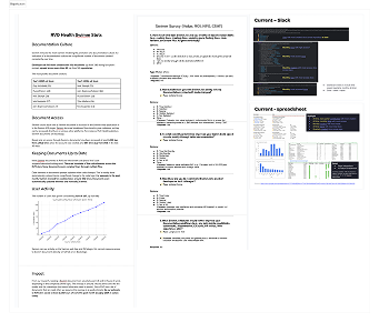
Enterprise clients were relying on adoption metrics sent by Swimm's customer success team to understand how their teams were using the platform. It usually contains quarterly metrics sent as Slack message, yearly metrics sent before the renewal, and any additional spreadsheets sent upon request. This process was:
⏱️ Time consuming
Metrics had to be manually filtered, graphed, and compiled internally
🚫 Inaccessible
Clients only received updates periodically, not on demand
🫥 Limited
Insights were curated by CS teams, with no way for clients to explore the data themselves
“We need to show leadership how Swimm is being used — but we can’t dig into the data ourselves.”
This challenge led to our guiding question:
How might we provide enterprise clients with a self-serve way
to understand adoption metrics?
Defining adoption metrics
Swimm's current backend data spans across docs, users, repository, tools, etc. Given it's complexity, we need to scoped our MVP tightly to deliver the most immediate client value. The primary focus and user journey established for our initial MVP will aid users in:
- Understanding documentation adoption at a glance giving them a clear baseline of engagement across their teams.
- Spotting champions and gaps in adoption by accessing complementary user activity and tool integration signals.
Prioritization and defining metrics to show.
Design Process
I began by researching analytic dashboards from other enterprise products — including Figma, Docusaurus, and Amplitude — to identify design patterns and considerations we could adapt. This helped shape decisions around layout, placement, data visualization styles, and card design.
Dashboard research from document analytics to general adoption metric.
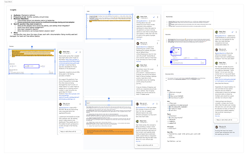
Next, I explored the information hierarchy and layout of the dashboard. Should all adoption metrics live on a single page, or would splitting them into sections improve comprehension? I also tested different visualization types and filter logics, producing early wireframes before aligning with developers on feasibility.
Lo-fidelity of layout and visualization studies
Finally, I focused on making the data accurate and trustworthy. I went over Clickup tickets and audited multiple internal data sources to identify discrepancies and refined the definitions of key metrics to match client expectations. For example, I clarified that “Doc Created” should mean a document saved to the repository — not just a draft. These steps ensured that clients could trust the numbers in the dashboard and confidently use them in leadership reports.
View counts from multiple platform sources
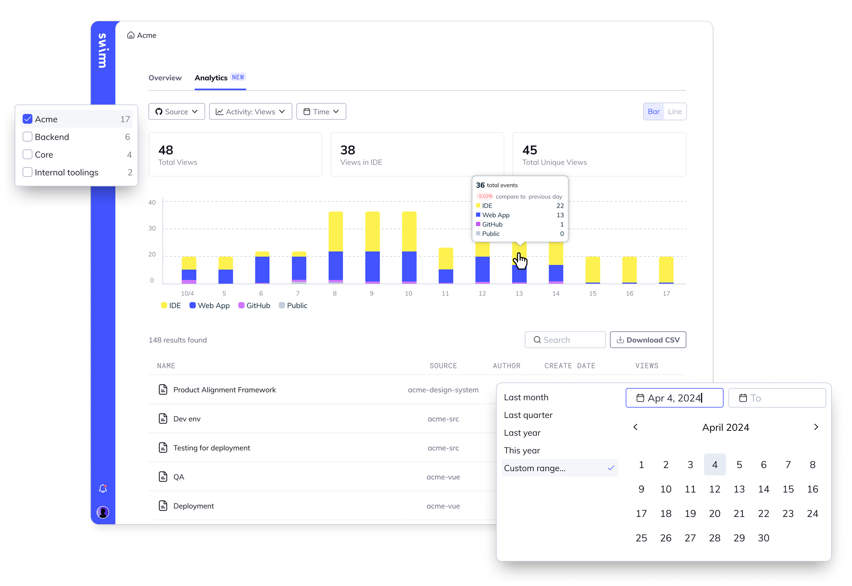
Final implementation
When clients entered the dashboard, they immediately knew where to navigate and how to find the data they needed. The design prioritized clarity, trust, and self-serve exploration.
Trend & raw data
Stats focused only on Swimm’s core asset, docs. The visualization portrays snapshot, trend, and detail related to the selected activity. It also portrays the necessary details. Ex. multi-source views, creation, update.
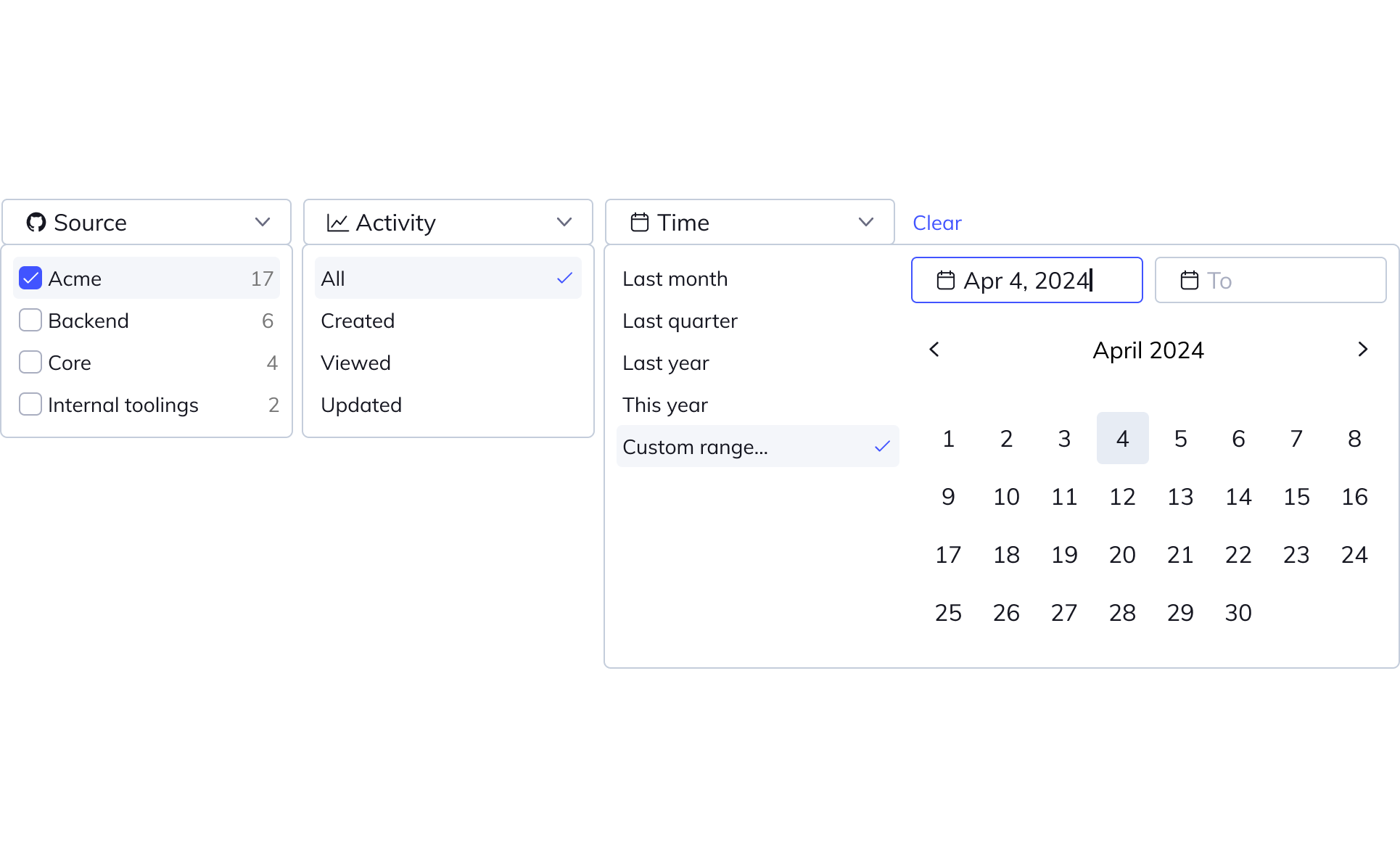
Filtering
An advanced horizontal filter bar allowed clients to slice adoption data by time, activity, repo, or author. This also supported cross-workspace stats, so admins didn’t need to jump between accounts within their organization.
Sortable table view
Tables will be default sorted base on the "activity" dropdown selection, this way it shows which docs are newly created, newly updated, or has most views.
Prioritized raw data table with sortable, filterable columns and a downloadable CSV
User adoption
To avoid over-complicating the dashboard view, complementary stats such as “tool adoption” and “user activity” were placed under existing User Management.