Google Cloud Design System
Cymbal is a fictitious brand created by the Google Cloud Demo, Experiments & Experiences team to tell a variety of stories about Google Cloud's products and solutions.
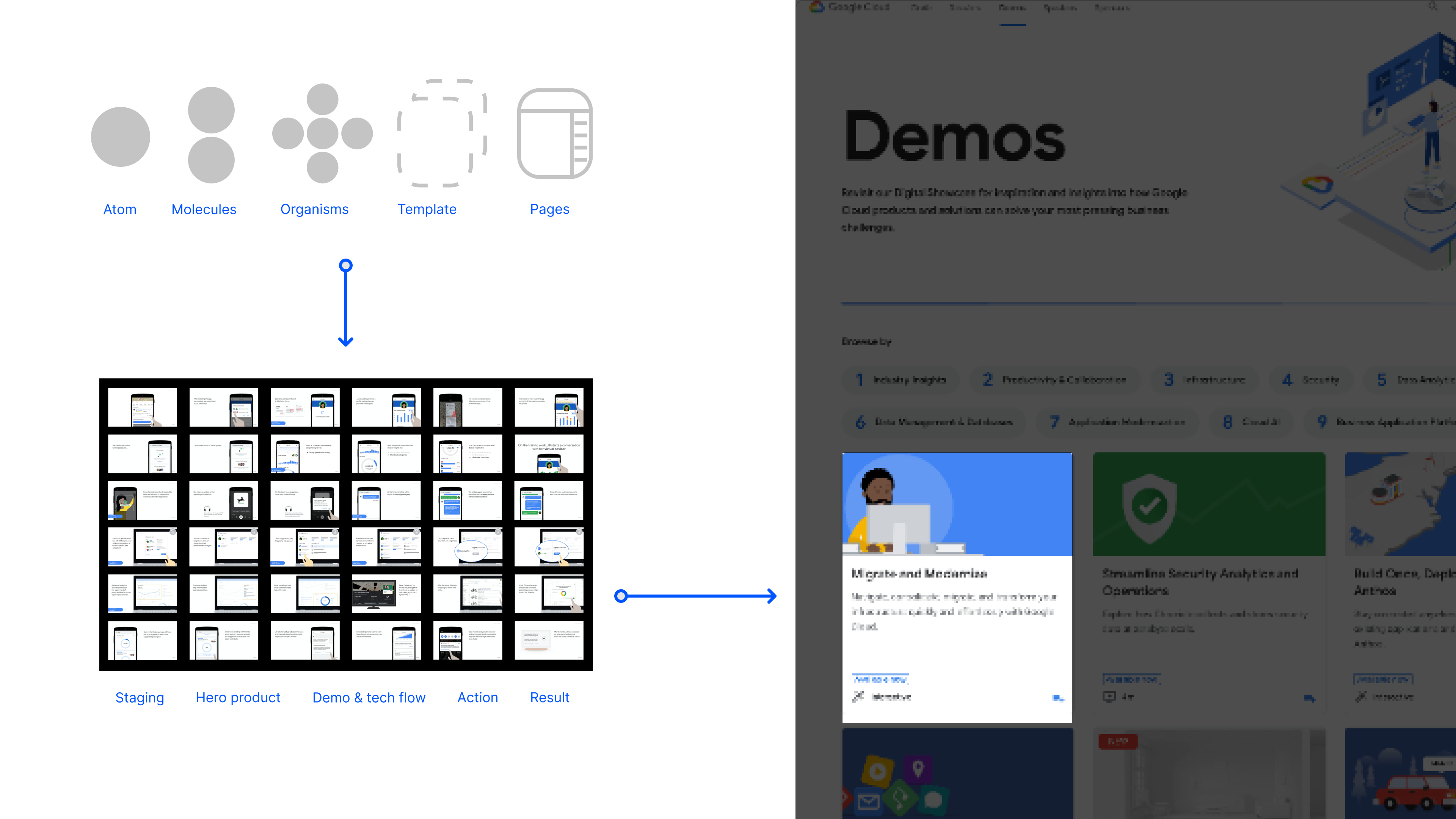
The project goal is to create a visual system to speed and standardize the way Google Cloud's demos are built and shared.
This project is under NDA. I am unable to share the content to the general public. I would love to share the password and speak to you about my experience.
Hit me up at linshujuuu@gmail.com
Role
Material Design System, Motion Design
Team
Flora Chan, Art Director
Derek Hunt, Senior Designer
Shuju Lin, UX Designer
Background
Google provides multiple cloud solutions for companies who wish to have a digital presence online, from sentiment analysis that could be implemented on automated customer service, to database that could store branch location and inventory statistics. To illustrate these solutions better and how they could be of benefit to companies, Google creates video and interactive demos for pitching purposes. As more and more teams get involved in the creation, the demos soon became inconsistency.
How demos are created
The teams are usually composed of team managers, designers, and engineers. We start off by looking at how they create these demos:
Identify potential client to pitch the solutions
Team manager create pitch decks with key screens on how they would want to sell the solutions
Designers or engineers implement key screens
Scope
Base from the workflow above, we realized that the two areas of improvement to speed up the creation while retaining consistency are:
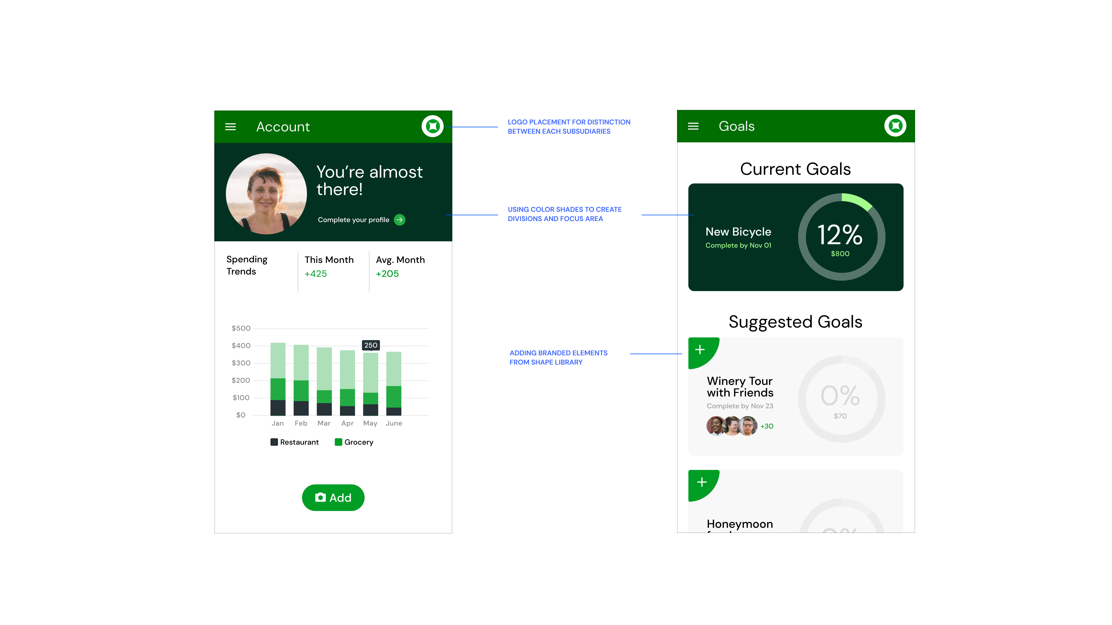
As seen in the breakdown, the interface is part of a bigger structure of a pitch deck's key screens. We still need to tap into Google Material Design to make the components consistent as a brand but distinctive as their own subsididary.
How might we create a visual system consistent yet distinctive enough across different subsidiaries?
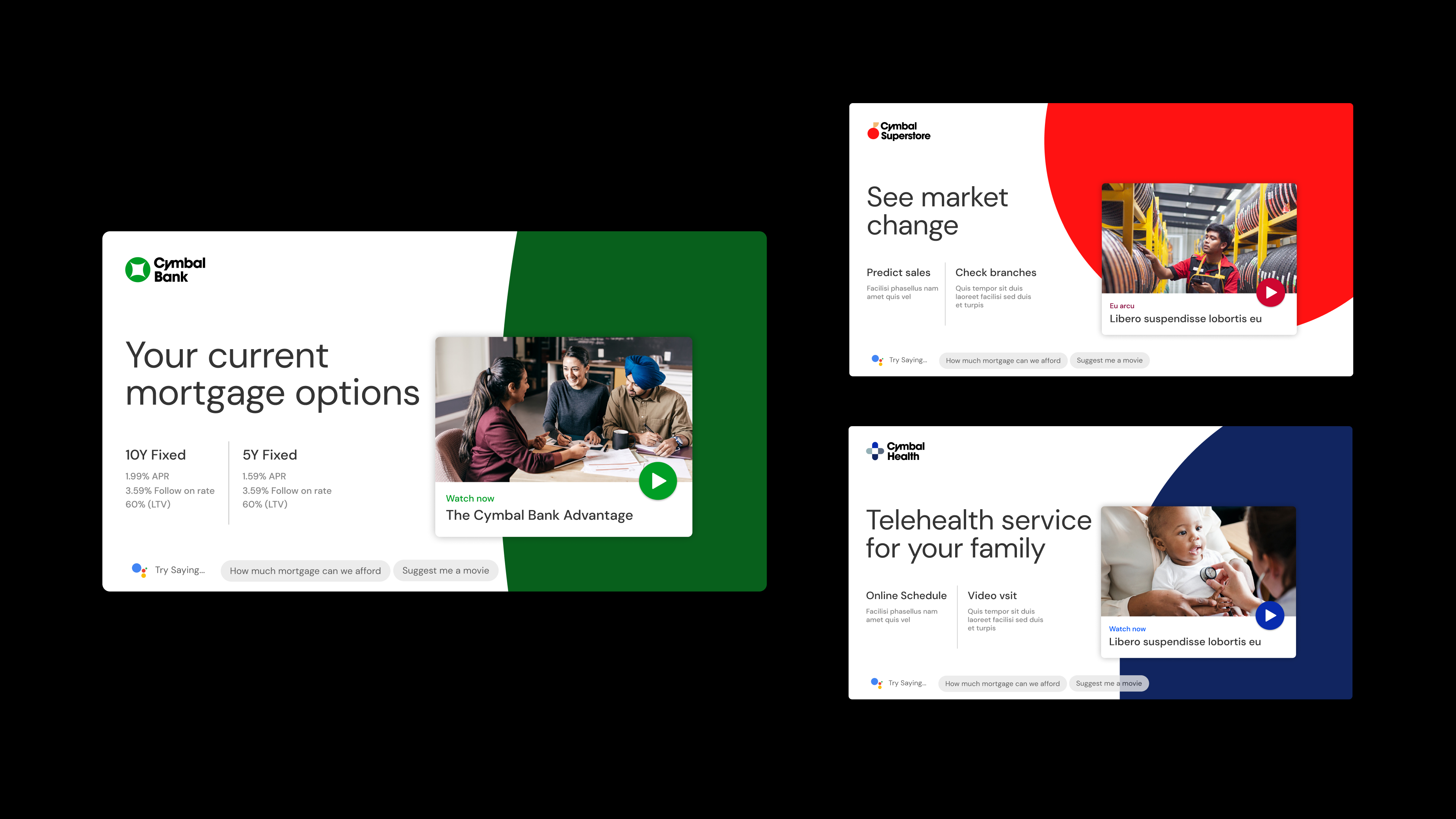
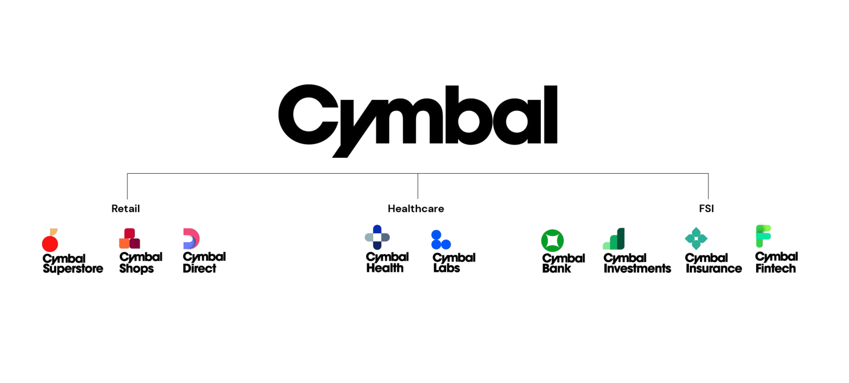
Brand foundation to digital presence
Based on the brief from Google team, Cymbal brand was created, along with three industries and six subsidiaries under it. We will have to translate brand foundation into its digital interface to create uniformity while still retaining the differences among each of them. The different aspects of execution are:
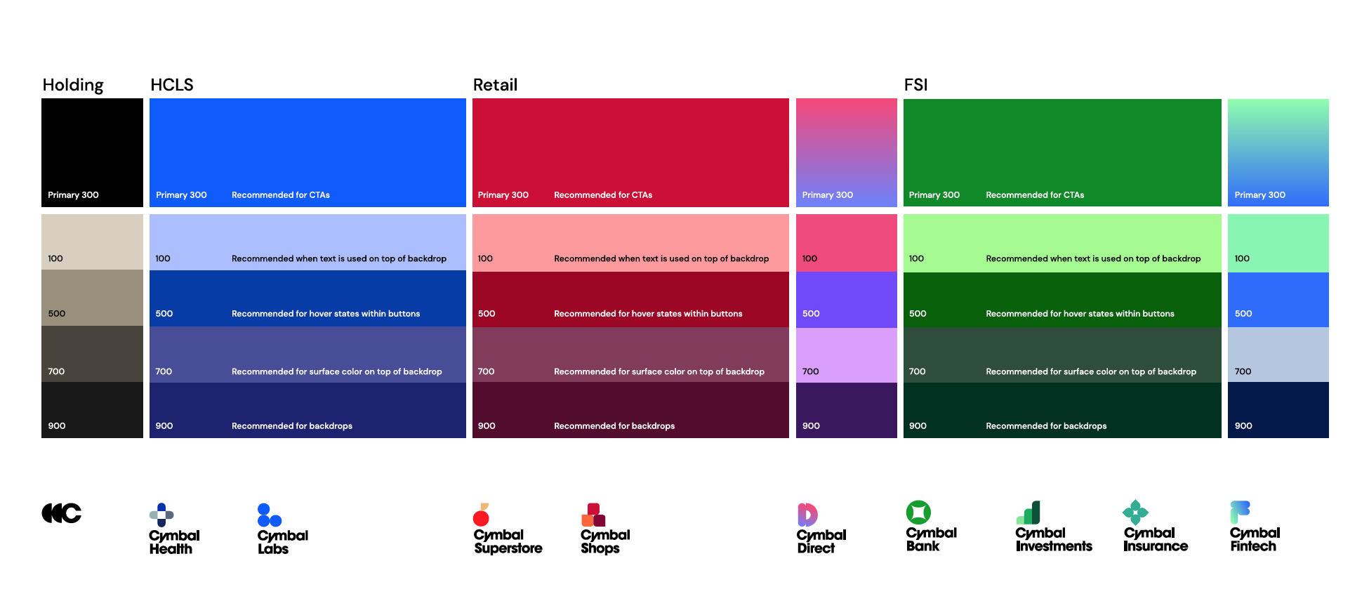
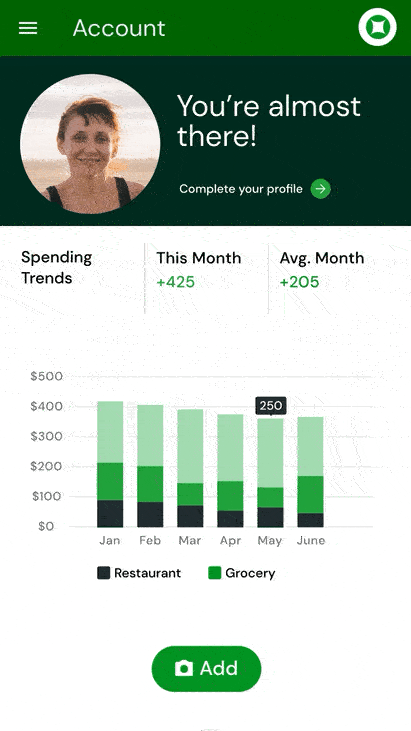
Color palette - Expand and establish sets of hues and shades that could accommodate information heavy interface while making sure they are complimentary and meets accessibility guidelines
Logo system - Retain brand essence by incorporating the modular shape library used to build the logos
Subsidiary distinction - Identify unit of identification within components
Brand personality - injecting brand attribute and subsidiary distinction with motion
Color system expansion
First, we explore the color system and expanded them into different hues and shades to accommodate the demo creation each industry further into.
Shape library application
All our logos are derived from a combination of geometric shapes from an icon grid. The concept of this library of shape spans are seen through out the brand, from pattern creation, to super graphics, and to container that house imagery.
Creating subsidiary distinction
All our logos are derived from a combination of geometric shapes from an icon grid. The concept of this library of shape spans are seen through out the brand, from pattern creation, to super graphics, and to container that house imagery.
Motion design as brand expression
The most common motion we seen across the demos are page transitions and progress indicators. We want to further explore its possibilities for brand expression. Page transitions are accomplished through super graphic motion, acting as a reinforcement to this shape of library concept we are creating. On the other hand, we draft out storyboard and animated logos that made sense to its shape and form for progress indicators.